

Have you ever wondered how your computer can make your text whatever size you want, and still have nice smooth letters? The trick, of course, involves math and algorithms, but it is drawing of shapes that we interpret as letters and numbers instead of the fractal art I usually write about.
The easiest way to make a font is simply fill in certain pixels in a grid for each letter. This is called a bitmap font - the shape of each character (called a glyph) is just an array of pixels either on or off, like this letter 'A'.

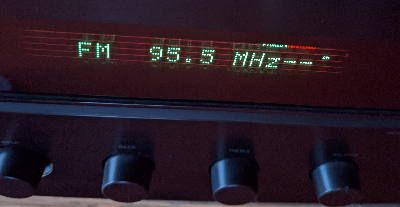
This type of font was used in early computer systems, but is still common in LCD panels in single-purpose electronics, such as my stereo shown below, or displays you would drive with an Arduino or Raspberry Pi. These fonts work fine for text that never changes size. But to make the text bigger or print it on paper, the pixels themselves grow and make the text look blocky.
One solution, of course, would be to define a different set of bitmaps for every font size you need, but that is impractical and inefficient. The solution used by modern computer systems is to define each glyph using a set of Bézier curves.
A Bézier curve is a just a type of parametric curve, where the x and y coordinates are both functions of the parameter t. For example, a circle can be drawn using a parametric equation x(t) = cos(t), y(t) = sin(t).
A Bézier curve works the same way, but uses three "control points" (we'll call them A, B, and C) to define the curve using:
x(t) = B.x + (1-t)²(A.x - B.x) + t²(C.x - B.x)
y(t) = B.y + (1-t)²(A.y - B.y) + t²(C.y - B.y)
The parameter t sweeps from 0 to 1.
Points A and C set the endpoints of the curve. Point B works like a stretching a rubber band, pulling the curve out in one direction or the other. Many different curves can be made using this system, like the two below, which have the same A and C endpoints, but a different B.

Multiple Bézier curves can be chained together to create more complex shapes, like this S-curve, where the C point of the first curve is shared by the A point of the second.

It's easy to see how Bézier curves can be used to define the outlines of different font characters. Instead of storing pixels to define each glyph, the font definition stores a set of control points, and your computer plays "connect the dots" using the Bézier function whenever a glyph is needed at a new size. Here are the control points used to draw an 'm' in the Lato font, drawn in test mode using my Ziafont Python package:

You'll notice there are open and filled circles. The filled circles are the endpoints of each curve (A and C as we called them). Open circles are the "off-curve" control point (B). You'll also notice there are some straight segments, such as the left leg of the 'm', which are just straight lines with no off-curve point. Along the top curve of the 'm', you'll see several off-curve points in a row - this can be done, and saves space in the font file, because the endpoint shared by two adjacent curves can be calculated exactly by restricting the curve to a smooth, continuous shape (consider removing the center point of the above S-curve, it can be inferred as halfway between the adjacent points). The open-type font specification plays a number of tricks like this to save space in the file. The software that draws the font has to interpret the set of control points, and connect them with either straight lines or Bézier curves, and fill in the area inside the curve, at whatever size and resolution you need.
So I would say, yes, font design is a form of art based on algorithms!
For way more than you ever wanted to know about Bézier curves, see the excellent A Primer on Bézier Curves.
Copyright © 2024 codeismycanvas.art